Buttons
Buttons communicate actions that users can take. Buttons are typically placed throughout your UI, in places like: Dialogs, Modals, Forms, Cards and Toolbars.
Button variants
There are three different sizes of buttons to choose from: xsmall, small and large. Our button variants can also be customized with icons next to the label to clarify the action.
1 | <button class="btn btn-primary" type="button">Primary button</button> |
Destructive button
Only use warning buttons for actions with serious destructive consequences that cannot be easily recovered or undone by a user. For example, permanently deleting an account.
1 | <button class="btn btn-guiding-destructive" type="button">Guiding destructive button</button> |
How to use destructive buttons
Do
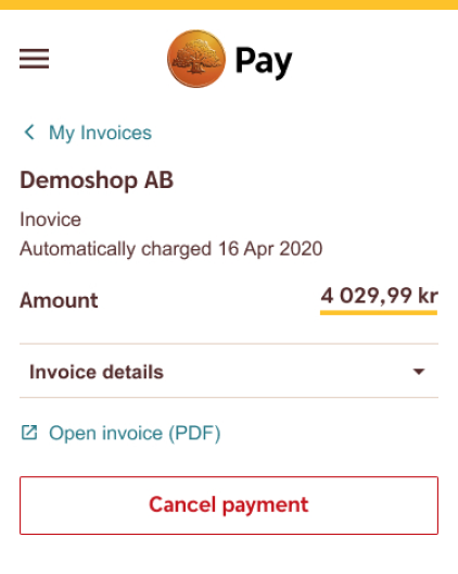
Use the Guiding Destructive Buttons to initiate a destructive action.
Don't
Avoid using the Executive Destructive Buttons to initiate a destructive action.
Do
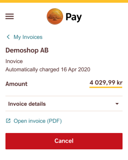
Use the Executive Destructive Buttons a contained space as a final destructive call to action.
Don't
Avoid using multiple Executive Destructive Buttons in the same user flow.
Content guidelines
The intention of a button should be clear and predictable. Users should be able to anticipate what will happen when they click on a button. Buttons should always lead with a strong verb that encourages action. Provide enough context for users by using the {verb} + {noun} content formula instead of using “Yes”, “Confirm”, “Cancel” – except when it comes to the Text Button, which commonly uses “Cancel”. To avoid buttons breaking in smaller interfaces due to long names, always check that the button looks OK in a mobile view. Generally, try to keep the number of characters fairly low to provide more clarity.
Unique naming
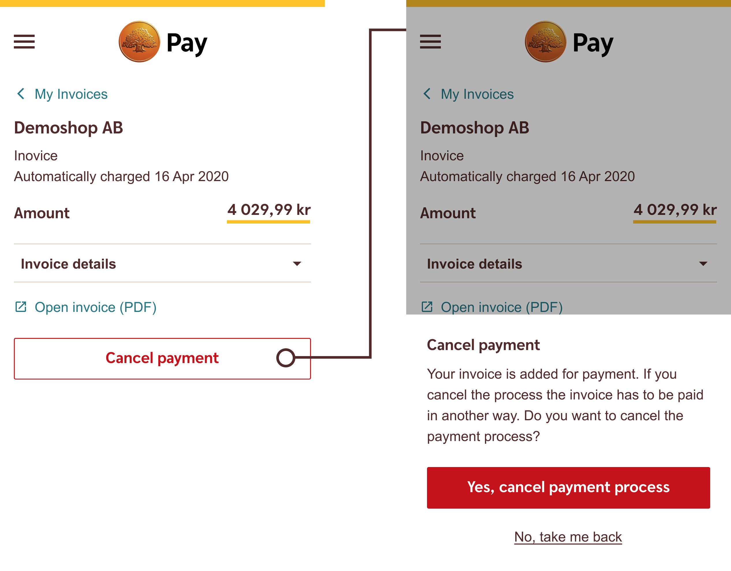
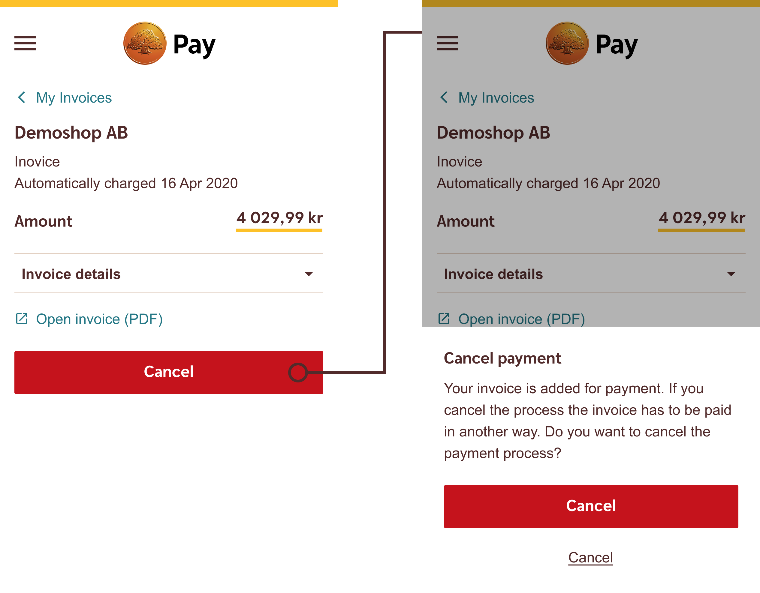
Avoid using the same name for multiple buttons in the same user flow. It’s particularly hard for users using a screen reader to tell four “Next” buttons one after another apart. When combining an "Executive Destructive Button" with a "Text Button" be careful to not name both buttons “Cancel”. Try to separate the text as much as you can to improve the user experience, providing the user from accidentally making the wrong choice.
Do
Make sure to differentiate the naming so that the user understands the difference between the actions the user can take.
Don't
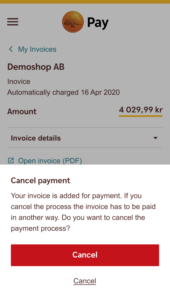
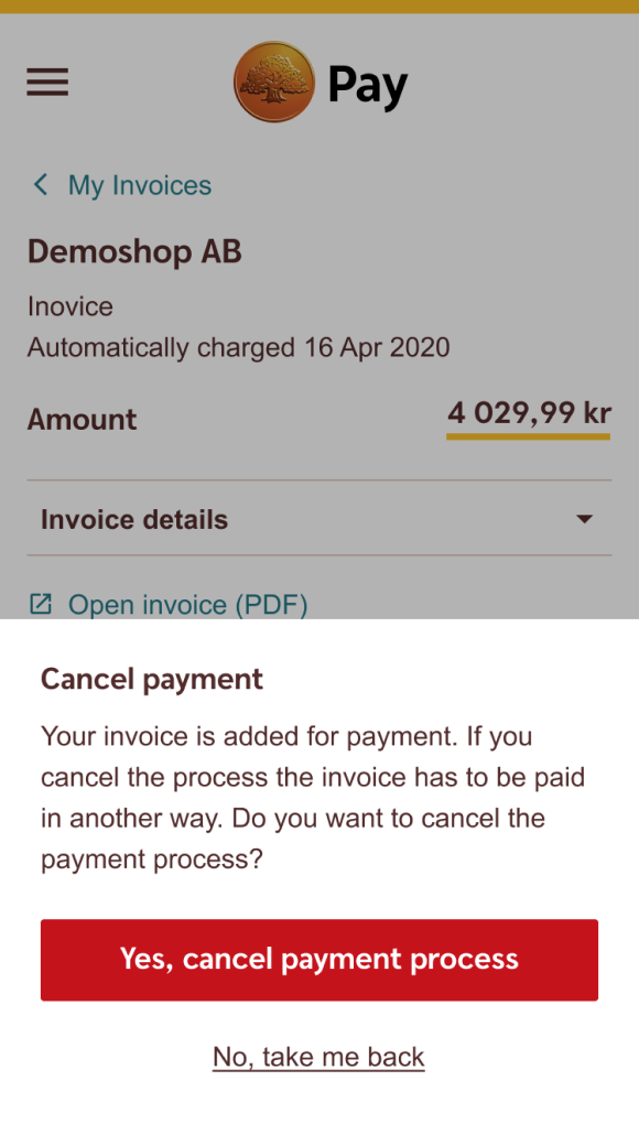
Avoid naming an Executive Destructive Button poorly – the button cancels the payment of the invoice and not the invoice, which isn’t clear at all.
How to use icons
Do
Use an icon to further convey the action, e.g. a trashcan icon for a delete button.
Combining buttons
When using buttons next to each other, always wrap them in a .button-group and make sure to use 8px spacing between the buttons, both in horizontally and vertically groupings. Strive not to use multiple buttons of the same kind – instead, use Action links.
1 2 3 4 | <div class="button-group">
<button class="btn btn-primary mr-1" type="button">Activate</button>
<button class="btn btn-secondary" type="button">Disable</button>
</div>
|
How to combine buttons
Do
Place buttons in hierarchal correct order and combine different kinds of buttons.
Do
Place buttons side by side in desktop view.
Do
Use the Link button as a discrete option to cancel.
Do
Combine Executive destructive buttons with normal Link buttons.
How not to combine buttons
Don't
Don't use the Secondary button and/or the Link button above the Primary button.
Don't
Don't combine Primary buttons with Destructive buttons.
Don't
Don't use and combine Destructive buttons the same way as normal buttons.
Don't
Don't use multiple Primary buttons or combine with BankID button.
Developer documentation
Disabled state
Make buttons look inactive by adding the disabled boolean attribute to any <button> element.
1 2 3 4 5 6 | <button class="btn btn-primary mr-1 mb-2" disabled type="button">Primary</button> <button class="btn btn-secondary mr-1 mb-2" disabled type="button">Secondary</button> <button class="btn btn-link mr-1 mb-2" disabled type="button"><span>Link</span></button> <button class="btn btn-executive-destructive mr-1 mb-2" disabled type="button">Destructive Executive</button> <button class="btn btn-guiding-destructive mr-1" disabled type="button">Guiding destructive</button> <button class="btn btn-link-destructive mr-1" disabled type="button"><span>Destructive link</span></button> |
Disabled with <a> tag
Disabled buttons using the <a> element behave a bit different:
<a>s do not support thedisabledattribute, so you must add the.disabledclass to make it visually appear disabled.- Some future-friendly styles are included to disable all
pointer-eventson anchor buttons. In browsers which support that property, you won’t see the disabled cursor at all. - Disabled buttons should include the
aria-disabled="true"attribute to indicate the state of the element to assistive technologies.
Link functionality: The .disabled class uses pointer-events: none to try to disable the link functionality of <a>s, but that CSS property is not yet standardized. In addition, even in browsers that do support pointer-events: none, keyboard navigation remains unaffected, meaning that sighted keyboard users and users of assistive technologies will still be able to activate these links. So to be safe, add a tabindex="-1" attribute on these links (to prevent them from receiving keyboard focus) and use custom JavaScript to disable their functionality.
Loading state
Use the loading state to show users their action is processing by adding the .loading class to the <button> element, and the disabled attribute.
1 2 3 4 5 6 | <button class="btn btn-primary loading mr-1 mb-2" disabled type="button">Primary</button> <button class="btn btn-secondary loading mr-1 mb-2" disabled type="button">Secondary</button> <button class="btn btn-link loading mr-1 mb-2" disabled type="button"><span>Link</span></button> <button class="btn btn-executive-destructive loading mr-1 " disabled type="button">Destructive executive</button> <button class="btn btn-guiding-destructive loading mr-1 mb-2" disabled type="button">Destructive guiding</button> <button class="btn btn-link-destructive loading mr-1 mb-2" disabled type="button"><span>Destructive link</span></button> |
Usage with other tags
The .btn classes are designed to be used with the <button> element. However, you can also use these classes on <a> or <input> elements (though some browsers may apply a slightly different rendering).
When using button classes on <a> elements that are used to trigger in-page functionality (like collapsing content), rather than linking to new pages or sections within the current page, these links should be given a role="button" to appropriately convey their purpose to assistive technologies such as screen readers.
1 2 3 4 5 | <a class="btn btn-primary mr-1" href="#" role="button">Anchor</a> <button class="btn btn-primary mr-1" type="button">Button</button> <input type="button" class="btn btn-primary mr-1" value="Input"> <input type="submit" class="btn btn-primary mr-1" value="Submit"> <input type="reset" class="btn btn-primary mr-1" value="Reset"> |